
10 Expert Tips for Creating an Effective Website Footer

The simplest elements often make the largest difference.
When it comes to building a website, designing the footer is usually not at the top of your priority list.
While you may have a lot on your mind, keep in mind that this sometimes-missed piece of information may make or break many visitors.
So, always consider a website design company that is a pro at making footers.
A well-designed footer may help you achieve your company objectives with some effort and smart preparation.
Table of Contents
What’s a Website Footer?
The footer of a website is a section located at the bottom of each page, below the main body text.
While the design of your homepage often gives visitors a first impression of your website, your footer is the final thing they will see. It may help you accomplish the major goals of your website by creating a favorable and enduring impression with the appropriate content and design.
The last CTA (call-to-action) should be added at the footer to encourage website users to contact you or join your mailing list. In order to ensure that visitors have not missed any important information and to provide them with straightforward access to your various pages, your footer might act as a supplementary website menu. Additionally, you may decide to emphasize particular features, including accolades you’ve received, client recommendations, or your social media profiles.
You have a designated area in your footer where you may add essential details like terms and conditions, privacy policies, and other legal matters. You’ll be able to focus on giving your site’s remaining space to users and bringing in new clients now that all these forms are in one place.
The size of footers varies. However, the majority of them are rather tiny and just include the most important information such as your contact information.
But which components should you include? How do you maintain the footer structured and consistent with the rest of your design without becoming intrusive? You’ve arrived at the correct location. Here, we’ll look at some techniques for designing a fantastic footer, as well as examples of websites that do it effectively.
1. Keep it simple

When working with a large amount of information, such as a footer, a simple design is essential. Stick to clean elements, lots of space, and purposeful organization. The size of your footer is frequently tied to the amount of content and the number of pages on your website. Check out this example of avo.
2. Let them contact you
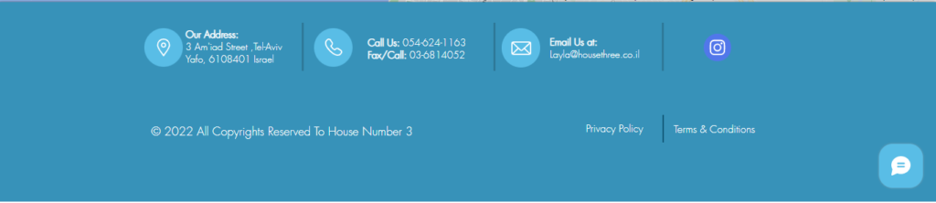
The “About Us” and “Contact Us” sections are two of the most significant links in any website’s footer. Users will be curious about who you are and what your company or brand stands for. Make it simple to locate the information. Many people will want to know who your team members are and how to contact them. Check out how creative agencies have used this method effectively for House Number 3.
3. Organize

Grouping similar footer elements together help to organize links and information. Consider including many columns (or rows) of pertinent information like contact information, links, services, social media, and parts from your most popular sites. Place each section beneath a header so that every piece is visible and easy to discover. Check out this example for letsone.
4. Copyright

This brief piece saves your life. Don’t overlook it. You can design it to be more incorporated into the rest of the footer rather than being displayed as a single line across the bottom of the screen like it is on most websites. It is possible to write a copyright notice or simply use the little, circular “c” sign. Adventure.com is a simple example.
5. What next?
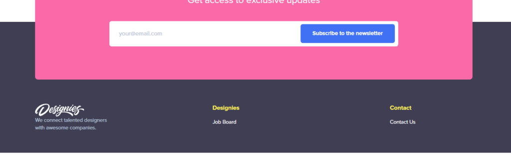
Give users something to do once they’ve reached your footer by including a link to it. Add a box for people to subscribe to your e-newsletter or ask them to follow you on social media. Do not underestimate this area’s potential for converting clicks. Lola pate shows this well.
6. Include graphics
Logos or graphic components might be used to increase visual interest. Just be careful not to stuff this tiny room too full of things. Consider it like this: Include symbols for these platforms rather than writing out “Follow me on Facebook/Twitter/whatever.” For links, you could also utilize tiny iconic elements like phone numbers or maps. Designies show it really cool.
7. Color and contrast
information in the footer is too little. Because of this, considering the color, weight, and contrast between the text elements and background is crucial. The words should all be legible. Think about using plain typefaces and a little bit more leading than you might normally do. Choose hues that have a stark contrast, such as a bright backdrop with black lettering or a dark background with white type. Use plain typefaces and avoid using contrasting colors. Check out how branding agencies for P53 have kept it.
8. Size matters
Footers, by definition, include a large number of little objects. Just make sure not to go too tiny. Text can be a few points smaller than the main body of the website. Icons or pictures must be viewable at the size you select. (It’s probably too small if you can’t see what the icon is.) Elements must be big enough to click or tap on. If users are unable to view the links because they are too small or too close together, they will not function properly. Check this example of Curious Space.
9. Try a sub-footer- it’s trendy!

Consider using a sub-footer to create more layers. If the footer area is too crowded, the sub-footer might be a wonderful spot to add some more hierarchy, give it some dimension, or just give some room for entertaining content. Incorporate a call to action or emphasize achievements in this section. Have a look at this example of Smart Passive Income.
10. Hierarchy
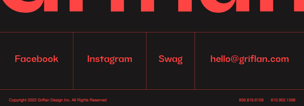
A website footer should be hierarchical in structure, much like the body of the site. It has a two-fold construction. In terms of the general structure of the website, the footer should be last. (After all, that is where it is.) Within its “container,” the footer should likewise have a hierarchy of items. The most crucial components—often contact details, a call to action, or a site map—should be the ones that stand out the most. The most basic information, like the copyright notice, is sometimes the shortest. Just like Griflan.
Why are footers important?
- They provide site visitors with one more opportunity to complete the desired action. If you want users to join your mailing list, view a product demo, or contact you, inviting them at the conclusion of a scroll, similar to CTAs at the end of commercials, is a powerful call to action.
- They establish a path for active engagement. By incorporating navigation links into the footer, you allow site visitors to continue browsing without having to scroll back up.
- They provide access to crucial information but should not be given major billing (i.e. your copyright info, privacy statements, and legal disclaimers).
Final Words
Your website’s footer might reveal a lot about it. It explains to visitors who you are, what you provide, and how to utilize your website. Additionally, it reveals subtle qualities about you as a designer, such as your attention to detail and capacity for working in confined areas.
An essential component of the design is the footer. Be mindful of it. To make the most of the bottom area in any web design project, be sure to incorporate the ideal balance of content, design components, and usability.
Author Bio:
Brijesh Jakharia co-founded SPINX Digital in 2005 and takes great pride in crafting web and mobile marketing solutions for mid-market businesses to enterprises. Marketing is his passion, and the thrill to build a brand from the ground up has helped him craft successful brand stories for world-class clients. While not at work, he loves to spend his time on research and reading digital content stories.