What Comparison Sites Teach About Keeping Visitors?

Why do some web pages hold a visitor for several minutes while others lose them in seconds? Anyone who has poured hours into a landing page knows the frustration of watching the bounce rate climb. Yet a quiet corner of the internet has quietly mastered the art of holding attention: the comparison site.
These pages juggle dozens of options, heaps of data, and fierce competition for the click — and the best of them keep readers scrolling, comparing, and acting.
For UK business owners and marketers, the design choices behind them are a masterclass in turning curiosity into conversion.
Few examples are studied more closely by digital marketers than the leisure and entertainment niche, where comparison pages have become almost scientific in their layout.
Take a guide to non gamstop casinos, a 2026 resource built for UK players who want to understand what GamStop is and how offshore sites differ from the home-grown variety.
Such guides exist because readers arrive with genuine questions about legality, safety, the bonuses on offer, the range of games, and which payment methods — including crypto — are accepted.
The page earns its keep by answering those concerns in a clear, structured way and helping the visitor decide which reputable site suits them. That is precisely the editorial challenge every comparison page faces, and it is why marketers treat these guides as a teaching tool.
The First Five Seconds Decide Everything

Visitors form an impression of a page faster than most realise. A cluttered header, a slow-loading hero image, or a wall of unbroken text and the visitor is gone before reading a single useful line.
The strongest comparison sites open with what designers call a “value proposition above the fold” — a single, plain sentence that tells the reader exactly what they will get and why it matters to them.
This is where so many business sites stumble. They lead with company history or a vague slogan, when the reader simply wants to know whether they are in the right place.
A good comparison guide answers that within the first screen: who it is for, what it covers, and how quickly the reader can find their answer. The lesson for any UK firm is blunt — respect the visitor’s time in the opening moments, or lose the chance to earn it later.
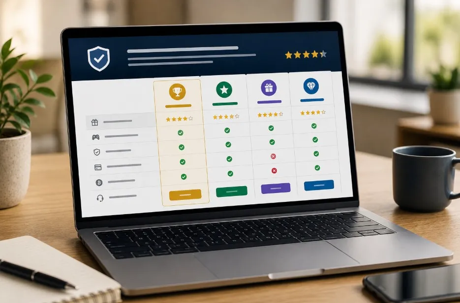
Trust Signals Do the Heavy Lifting
Nobody acts on a recommendation they do not believe. The best comparison pages understand this instinctively, weaving credibility into every section.
Expert-written reviews, transparent criteria, clear explanations of how rankings are decided, and honest notes about both strengths and drawbacks all combine to make the reader feel guided rather than sold to.
The same principle applies to e-commerce shops, SaaS sign-up pages, and service businesses across Britain. Genuine reviews, recognisable trust badges, plain-English explanations of how something works — these are not decoration.
They are the quiet machinery of conversion. Many comparison sites operate on an affiliate model, and anyone curious about how that works can read a beginner’s guide to affiliate marketing to understand why transparency is so central to keeping a reader’s trust intact.
Structure That Lets People Skim
Few visitors read every word. They scan, jump, and hunt for the part that answers their specific question. Top comparison pages are engineered for exactly this behaviour.
Short paragraphs, descriptive subheadings, comparison tables, and concise summary boxes let a reader land anywhere and immediately orient themselves.
Consider how a reader weighing up bonuses, game variety, or payment options behaves. They rarely read top to bottom; they go straight to the section that concerns them.
A well-built page serves that habit with clean tables and tidy bullet points rather than dense prose. For marketers, the takeaway is that good structure is not laziness — it is generosity. It hands control to the reader, and a reader in control is a reader who stays.
The Quiet Power of a Single Next Step
Choice paralysis kills conversions. Offer ten equally weighted buttons and the visitor freezes; offer one obvious next move and they take it. The most effective comparison pages guide the eye towards a single, clear action at each stage, then repeat it gently as the reader scrolls.
This is the discipline behind every high-performing call to action. The button copy is specific, the surrounding text removes hesitation, and nothing competes for attention nearby.
The affiliate sector has refined this approach into a genuine craft, and those wanting the wider picture will find a fast-growing tactic explained in plain terms. The core idea travels to any business: make the next step feel inevitable, not optional.
Speed, Mobile, and the Patience of Nobody
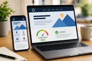
A beautiful page that loads slowly is a failed page. Comparison sites live or die by performance, because their audiences arrive on mobile, often during a spare few minutes, with little patience for spinning wheels. Optimised images, lean code, and fast hosting are not technical luxuries but commercial essentials.
Mobile-first design matters just as much. Tables that collapse neatly, buttons sized for thumbs, and text that never demands pinching to read — these details quietly decide whether a visitor finishes the journey.
The economics of these pages explain the obsession with detail; for the broader history of how that model grew, the entry on affiliate marketing sets out the full story.
Bringing the Lessons Home
The threads tie together neatly. Lead with clarity, build trust at every turn, structure for skimmers, point to one clear action, and serve it all fast on any device.
Comparison sites in the leisure space have refined these habits under intense pressure, and the results are there for any UK business to borrow. The page that respects its visitor — their time, their questions, their doubts — is the page that keeps them engaged and, in the end, converting.
Author Profile

- Blogger by Passion | Contributor to many Business and Marketing Blogs in the United Kingdom | Fascinated with SEO and digital marketing and latest tech innovations |
Latest entries
 TechnologyJuly 1, 2026AI Writing Tools and SEO in 2026: Trends, Risks, and the Case for Your Own
 Search Engine OptimizationJuly 1, 2026Why Gaming Brands Choose SEO?
 Search Engine OptimizationJuly 1, 2026Why Search Engines Limit Gaming Adverts?
 Search Engine OptimizationJune 30, 2026What Comparison Sites Teach About Keeping Visitors?