
5 Commonly Overlooked Design Mistakes On eCommerce Product Pages

It was back in 1994 when the first online sale was made – it was a Sting CD. The transaction happened on NetMarket, a website ran by 21-year-old Dan Kohn, where he sold his CD to a friend for $12.48 and paid for it using his credit card.
And that’s how eCommerce was born.
Online selling has come a long way since, as the world increasingly operates digitally. Advancements in technology have given businesses a world of opportunities on how to better reach and sell online regardless of geolocation, but this also means that the playing field has become even more competitive. Today, it’s not enough that your business is online; it also has to keep finding ways to make better and lasting impressions, and designing your eCommerce store with user experience that could turn clicks into sales and site visitors into actual customers.
However, while brands already have their eCommerce sites up and running, not all have spent enough time and effort on really building solid product pages.
The Importance of Product Pages in eCommerce Sites
A product page is the most important page on an eCommerce site, because when done right, it can solve all your shopping cart abandonment blues. Below are some of the reasons why it’s so important
It’s the Most Actionable Page on the Site
Product pages contain the most actionable content in your site, so it is crucial that you build your website in a way that it encourages a visitor to explore and convert on those pages. Remember, your product pages are the heart and soul of your online store, so you want to make sure it answers any possible query an interested buyer would ask before making a purchase decision.
It makes a Lasting Impression on your Audience
When it comes to eCommerce sites, a great home page is not enough to make your visitors stay. How your product page is structured and designed is how your market will remember you as it gives your online shop personality. If they find it difficult to see basic information about your products, then chances are they will leave your website and search for alternatives.
It’s the Page that could Improve your Bounce Rates
It is very often that in eCommerce sites, the pages with the ideal bounce rates are product pages, as users tend to read descriptions and go through content to learn more about the products.
It can Increase Return and Referral Visitors
If a visitor has only good things to say about their digital user experience on your eCommerce site, then they are more likely to return and make another purchase. They can even go as far as recommending your online store to their friends and family. That’s both building a loyal customer base while also nurturing potential advocates.
Abandoned Cart Statistics You Should Know
The reality is 98% of site visits won’t end with a purchase. The good news is numerous studies have been done to determine exactly what triggers a user to abandon their carts. Knowing these important online shopping statistics can guide you as your improve your product pages:
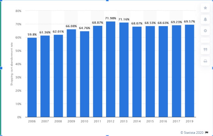
- According to Statista, online shopping cart abandonment rate worldwide is currently at 69.57%.
- eCommerce stores lose over 75% of sales to shopping cart abandonment.
- The current average conversion rates for cart abandonment emails is 8.24%.
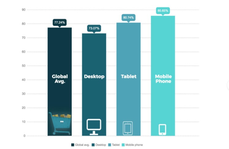
- The average cart abandonment rate is 73.07% on desktop, 85.65% on mobile and 80.74% on tablet.
There are many reasons as to why users choose to abandon their carts, but here are a few you should be aware of:
- 34% are not ready to buy.
- 34% due to the site requiring them to create an account before checking out.
- 55% due to the site requiring them to re-enter their credit card information.
- 17% due to potential security risks.
- 23% due to high additional costs like shipping rates, tax or handling fees.
- 59% due to limited payment options.
- 24% due to complicated site navigation.
- 57 % due to sites taking more than 3 seconds to load.
- 78% due to poor service experience.
As you can see, a negative experience on product pages and checking out is the answer to why eCommerce businesses fail. To help you build effective marketing strategies for your eCommerce brand, read on to discover fail-proof ways to spruce up your product pages and boost your online sales.
The 5 Commonly Overlooked Design Mistakes On eCommerce Product Pages
Updating product pages can be a bit daunting especially if you don’t know where to begin. To get your started, here are 5 of the most commonly overlooked eCommerce design mistakes and what can do to turn things around make your site more enticing, engaging, compelling, and actionable:
1. Not Understanding Product Alignment
Displaying your products horizontally or vertically can affect the market’s perception. In fact, research has shown that when product assortment is placed horizontally, the viewer perceives it as having more options and variety. This little display factor results in a buyer being more willing to purchase more than one item as opposed to a column-type format.
Fix:
Design your store in a way that your product pages are displayed horizontally. While humans are more likely to scroll down a page, it wouldn’t hurt to see if the research findings work for you. Group the same or related products by row, so visitors will find it easier to get to the type of product they’re looking for as well as the available varieties.
2. Not Finding the Right Balance between Text and Images
While images are essential to a successful buyer’s journey, text content is still key to boosting conversion rates. This is because besides rich media, product descriptions give online consumers a more holistic idea on how a particular product can meet their needs or solve their problems. Research has also shown that while humans perceive image data faster than text, they can better recall verbally-described products.
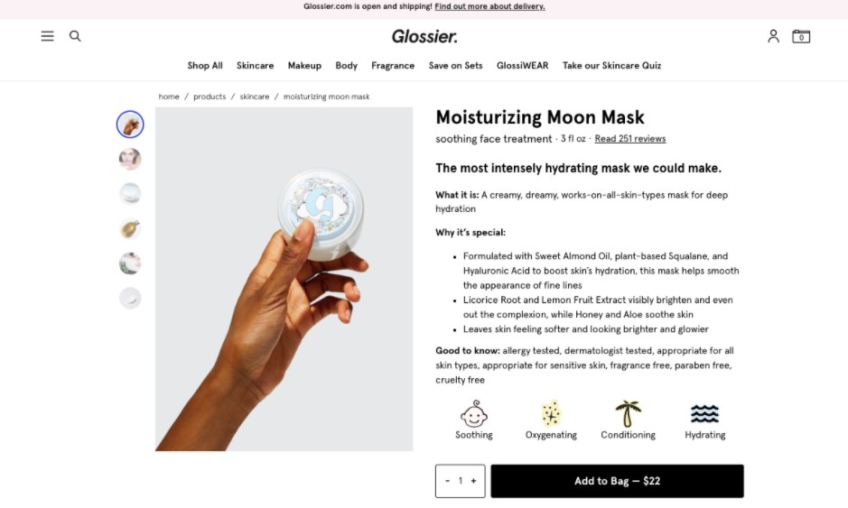
Image source: https://www.glossier.com/
Fix:
Despite a number of research done on the balance between text and images, there is still no concluded number of visuals that users deem “too many.” What you can do instead is run an A/B test on various product pages on your site and see the optimal number of images that provide the highest conversion rate. But do make sure that you have a healthy ratio of image to text no matter what.
3. Not using High Quality Images
Images with poor quality can make or break a sale. It is a very important element on a product page given that online consumers cannot physically touch and see the item they’re looking to buy. Add that to the fact that humans are visual beings, so giving them a clear idea on what to expect will help them make a better buying decision.

Fix:
Invest in having good product photos. Display them on the optimal resolution without affecting the loading speed of your site. Even better, allow users to zoom in and out on the image, so they are able to get a closer look. Quality is important – the higher the quality, the higher the conversion rates.
4. Not Leveraging on Related-Products
There’s a reason brick and mortar stores group similar products together – it provides the buyer options, alternatives, and extras. Doing so on your online store can potentially increase your sales as a visitor might discover a product he or she actually needs or wants as well besides the main item he or she went there for.
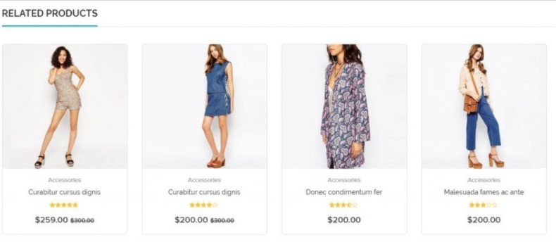 Image source: https://www.perzonalization.com/blog/shopify-product-detail-page-design/
Fix:
A lot of eCommerce platforms offer this particular feature, so make sure you choose one that could let you customize related products. You can either display it as “related products” or put something like “This pairs well with..” or “This is usually bought with…” In addition to that, see if the platform you’ve chosen can also provide reports if a particular product was purchased because a visitor has seen it while browsing for a different product. This type of data will be helpful on how you should group your products together.
5. Not Making your Site Mobile-Responsive

Image source: PhotoMIX Ltd. from Pexels
62% of smartphone users have made a purchase online using their mobile device. As people are constantly looking for on-the-go solutions, it’s no surprise that eCommerce would also benefit in designing their website to be mobile-responsive. Consistent user experience, regardless of screen size, is one way to keep a user from adding to cart only to later abandon it. If it’s easy to purchase on your desktop site, it should be the same with the mobile version.
Fix:
Keep in mind that those who are selling their web design services to you should know the importance of creating sites that are mobile-responsive. Focus on user experience and page navigation – from the moment they arrive on your site and view your products to adding items to cart and checking out – everything should be as seamless on mobile as it is on desktop.
Brands That Did Product Pages Right
Here are 3 examples of product pages to make you inspired for a revamp:
Helix Mattresses
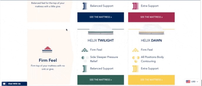
The best thing about how Helix Mattresses designed their product pages in a way that each product solves a specific problem. This makes it easier for visitors to know what particular product will fit their needs through compelling product description and visuals.
Bellroy
Bellroy is an Australian accessories brand that sells bags, wallets, cases, and key covers. Their product pages are interactive while also showcasing the brand’s unique value proposition – slim wallets. Content-wise it offers variety, rich media through gifs, concise product descriptions, and related products.
Ban.do
Ban.do is an L.A.-based company that offers a variety of lifestyle products such as stationery, apparel, and accessories. Their product pages display a high-res gallery of the items, product details, and persuasion triggers through bestseller tags and reviews. They also practice cross-selling by displaying related products through their “Goes well with” content.
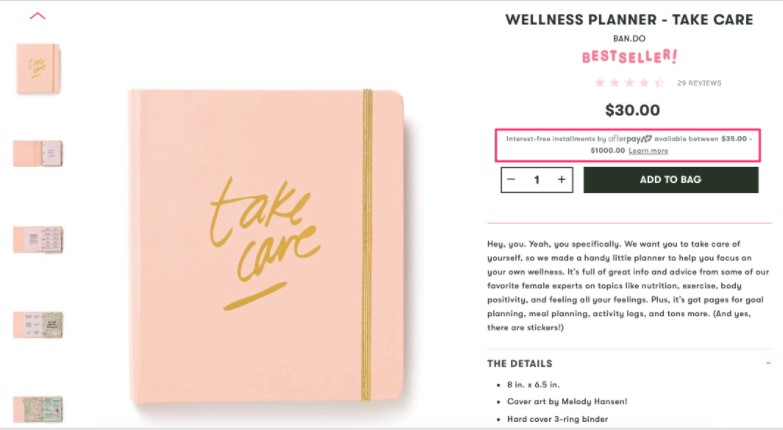
Image source: https://sleeknote.com/blog/product-page-examples
Takeaway
While these are all sound tips for improving your product pages, it bears mentioning that different elements work for different audiences. To find out which works best for your brand, continually A/B test how particular elements are performing.
Which parts of your product pages do you envision improving? Let us know in the comments below.
Author Profile
- Senior SEO Consultant and Blogger Outreach Expert at ClickDo Ltd. Also, I help Business Owners in the UK by flooding more Leads to their Business through Google Ads, Facebook Ads & Remarketing. Author in many premium UK blogs.
Latest entries
 Web HostingNovember 15, 2024Top Free and Low-Cost Tools for Managing Cost-Effective Dedicated Hosting
 TechnologyNovember 12, 2024Building a Secure Website: Why DNS Security Matters for Every Business?
 TechnologyNovember 9, 2024How Can AI Benefit Small Business Operations?
 Digital MarketingOctober 29, 2024Digital Marketing Strategies for New Online Stores