How to create high-conversion marketing CTAs


If you are reading this, you’ve been enticed by a CTA. We invited you in. You accepted the invitation. Purpose solved. But marketing CTAs are more than just a simple “Read more” text at the end of a Meta Description.
In this blog, we will cover:
- The basics of marketing CTAs
- The importance of effective CTAs, and
- A simple 5-step process to crafting your very own highly converting marketing call to action.
Let’s dive right in.
What is a call-to-action?

It doesn’t take Sherlock to guess what calls to action are. They are exactly what the name suggests. They are calls to the reader to take an action. They basically hold people’s hands and make them buy what you’re selling. Or take any other action that you may benefit from.
Your audience has the attention span of a goldfish. (Or maybe less!) They are constantly distracted by the content all around them. And your competitors are lurking just around the corner to drag your prospects away.
CTAs make sure your readers take the action you want them to take. It can be something small like clicking on your blog and reading it. Or something more monetary inclined like buying your product or availing of your service.
Calls to action can also be used to make people call your business, subscribe to your newsletter, RSVP to an event, or take any other action that you want them to. They can be in the form of plain text with no link (like in the meta description of this page). Or CTAs can be hyperlinked texts.
But the most popular form of CTAs? Buttons. And they are popular ‘cause they are highly effective. For CreateDebate, for example, making CTAs look like buttons, helped boost clicks by 45%.
Also, the call to action is a medium-independent concept. No matter if it is a website, a Google Ads campaign, a blog, an email, or a social media post, you need CTAs.
This brings us to…

The importance of an effective CTA
CTAs are important. For you and your audience both. Here’s how.
Do away with decision fatigue
Did you know an average adult makes 35,000 decisions every day? Now that’s bound to make anyone tired of deciding. CTAs help relieve some of this decision fatigue by telling people what they should do.
Like you saw at least 10 options pop up on your screen when you punched in your query. Our CTA pushed you to take an action by enticing you and your decision-making effort was reduced. Your CTAs do exactly that for your audience.


Ensure the effectiveness of your content
Whether it is a social media post that you create or a long-form blog, an email, or a landing page, the motive of your content is to get your reader to do something.
And CTAs make that happen. If you don’t urge people to do something, it can take them a long time to come to that conclusion themselves. They may not even do it. CTAs ensure that your content’s intent gets fulfilled.
Achieve your goals
We are all running behind our goals, right? You want more subscribers to your newsletter, more buyers for your products, more business inquiry calls, etc. And CTAs are the simplest way to do that. You tell people what they should do. And if you are convincing enough, you can race ahead toward your targets.
So how can you be “convincing enough” with your CTAs? It is no magic. You just need to follow a few steps and voila! You have your very own converting CTA. What steps? The ones detailed right below. Read on and boost your click-through rates.

How to create a CTA? 5 steps
Below we have detailed the CTA creation process that we at ClickDo follow.
Why is this process better than the thousands of others on the Internet?
- This process has been put to test. Our high-performing CTAs have been created using these steps.
- We have taken inspiration from others on the Internet. Our team has analysed 100+ high-performing CTAs, decoded their logic, and boiled everything we learned in the following concoction.
- You can get through this guide in under 10 minutes. We’ve kept it crisp.
Step 1. Pick the right words
The words you use for your CTA can make or break your marketing campaign. So, grab a dictionary, if you may. But get the words right.
Here are some tips to consider acing the wordplay.
– Strong command
Whether you believe it or not, your target audience has half a mind to go to your competitor. You cannot let them walk out the open door with lousy language. Use strong action verbs in your CTAs to urge actions.
– Play with emotions 
Did you know that emotions are the basis of 80% of the decisions that a person takes in a day? Touching the emotional nerve of your TG will certainly help in getting them to take the desired actions. Try using adjectives. “Book your dream vacation today!” Don’t be afraid of making promises. “Get the loan process in 48 hours.” Invoke FOMO. “Offer valid only till stocks last.” Highlight your USP. “Scientifically-proven formulation for healthy skin.”
– Proper reasoning and value 
Okay, emotions matter. But don’t let logic take a backseat when you are creating your CTA copies. Make sure your audience actually derives values from your CTA.
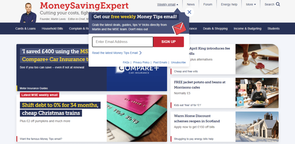
Take, for example, this newsletter subscription CTA from moneysavingexpert.com where subscribers are promised to get the hottest deals and money saving tips weekly.
Offering value. And signing up for weekly savings deals does sound enticing, doesn’t it?
– Add numbers
Did you know that 75% of people prefer red over blue? That makes you want to change the blue buttons on your site to read, isn’t it? 75%, after all, is a big number. But is it that 75 out of 100 people prefer red over blue? Or as in the case of this study, where 3 of my 4 friends said they liked red better than blue. Without this additional piece of information, I almost had you nodding your head in favor of red, right?
Sorry for the trickery, but that’s the power of numbers. Adding numbers near or in your CTAs can help you harness that power.
For example, instead of saying, “Subscribe to our newsletter”, you can say, “Join 13,000 marketing peers who receive our newsletter every month”.
The latter’s longer for sure, but more convincing. You can use prices, discount purchases, shipping time, etc. to boost the CTR of your CTAs.
– Minimize risk
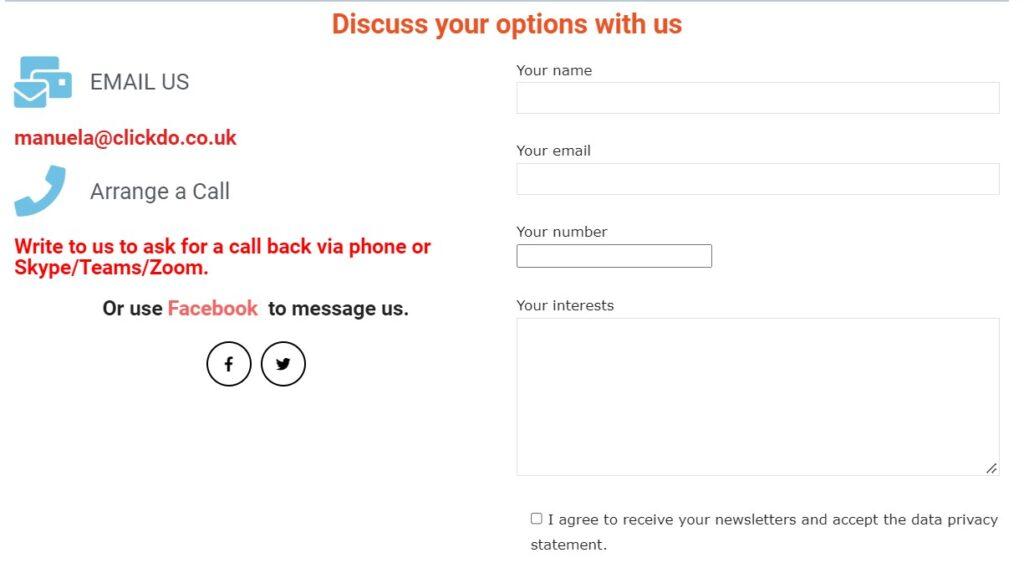
Actions have consequences. And sometimes people are scared of those consequences and thus, prefer to not take action. Your CTA needs to assure users that their actions are risk-free, like this one on the news.clickdo.co.uk blog where they are clearly informed about the fact that their data is processed for the newsletter and website communication:
For one they are mentioning that the data submitted via this form will be used for website and client communication. So, the user is aware of how their submitted data will be used.
They promptly offer contact alternatives for users that may not be happy with those terms. Well, you don’t have a reason to not contact them. There goes my click!
Here’s another example.

If you head to the ClickDo homepage you will find content and CTA buttons. On the right-hand side you will also find buttons that help you to contact ClickDo or arrange an appointment all free of charge. No risk involved. Absolutely clickworthy and easily manageable.
Step 2. Design it right
While your CTA text is of the highest importance, its design and that around it also matter.
– White space
The use of white space in design can make your call to action pop out. It also enhances legibility which further draws attention to your CTA. So make sure you add ample white space around your CTA.

– Colour contrast
If Unbounce and their research are to be believed, the best colour for calls to action is orange. A study by Dmix concluded that red CTAs won over the green. By a 34% margin.
Even HubSpot reports declared that red CTAs yielded a 21% higher conversion rate as compared to the green ones.
A study by Monetate, however, had contrasting results where blue buttons generated 9% more leads as compared to their orange counterparts.

So which colour should you use? Well, the one that offers a decent contrast on your website. And the one that performs well on your tests. While reddish colours are considered overall better, it is best to try and test CTA colours on your own before committing to any shade.
– Placement
Did you know that only 47% of websites have a clear call-to-action button that users can find in 3 seconds or less?
Now, what’s the purpose of a call to action that your audience cannot even see? The placement of your CTA also matters. A lot. Here are some of the ideal locations to make a CTA a conversion hotspot.
- Above the fold on the homepage, to prompt people to learn more.
- In the middle or at the end of a blog, to take people to more relevant content.
- At the end of a lead capture form, for upselling or offering gated content.
- An exit intent pop-up, to bring back visitors who are leaving your site.
If you are giving users two options for action, keep the primary action on the right. It is faster and in the flow of the reader’s eye.
Step 3. Know The Device
A recent study suggested that more than 50% of web traffic comes from mobile devices. If your CTAs are designed and positioned for just the desktop versions of your site, you can hope to let more than 50% of your visitors leave without converting.
The solution? Know what devices your target customers are using and optimize your CTAs for the relevant device. One pro tip for mobile CTAs is to place it at the bottom. That way, you don’t have to make visitors scroll all the way up to take an action.

Other than the sizing and placement, also note that intent varies with devices. When using mobile phones, for example, people are more likely to click on a “Call” button. You cannot expect your users to click on the phone CTA via desktops, right?
So, keep the intent in mind too.
Step 4. Break the pattern.
Alright, there is a set formula that you can follow for success. But with call-to-action buttons, what worked for others may not work for you. And that’s why, sometimes, you can (and should!) think out of the box and go bananas.
Quirky lines, snarky comments, and even outright rude CTAs have worked for brands in the past. And they might work for you too. If you are sure your audience will be game for some craziness, don’t hesitate to try out creative, off-the-beaten-path CTAs. Take a cue from what ClickDo did on the education.clickdo.co.uk blog:

Lesson 1 – A CTA shouldn’t be blunt. They know the user is going away. They make an honest effort to make them stay with a visual aid through a badge.
Lesson 2 – There is text that explains further what the badge is about and why users should click the “enquire” button. The visual addition makes this CTA more prominent and engaging.
Step 5: A/B test
Whatever, you do from Step 1 to Step 4 needs to be put to test. And A/B testing is the best way to find out what works for your business and create a CTA creation formula that brings in guaranteed conversions. According to a Leighton Interactive study, the average click-through rate for CTAs is 4.23%. The highest CTR, however, goes up to almost 70%.
So, you have a lot of room to keep experimenting and improving your CTAs. With that, you are now in on the secret sauce of CTA success.
Start following the recipe and our regular marketing blog tips go get clicks that count and convert.
Author Profile

- Chief Marketing Officer
- Blogger and Educator by Passion | Senior Online Media & PR Strategist at ClickDo Ltd. | Contributor to many Education, Business & Lifestyle Blogs in the United Kingdom & Germany | Summer Course Student at the London School of Journalism and Course Instructor at the SeekaHost University.
Latest entries
 AdvertisingJuly 1, 2025How AI Can Power Smarter Content Strategies for UK Brands
 BrandingMay 21, 20255 Digital Spring Cleaning Hacks to Boost your Branding
 E-Mail MarketingMay 7, 20258 Ways to Use AI in Smart Email Marketing for Better Deliverability and Engagement
 Digital CareersFebruary 28, 202510 Digital Detox Tips for Marketers – How to Make the Most of Unplugging Day


